Product Requirements Document — Archon Dashboard Visual & Interaction Redesign
Scope note: this is a project-specific PRD (not framework documentation) kept inside
docs/archon/adoption/because the Dashboard ships as an Archon surface. Framework-portable Dashboard contracts live in.archon/dashboard/and are outside this document.
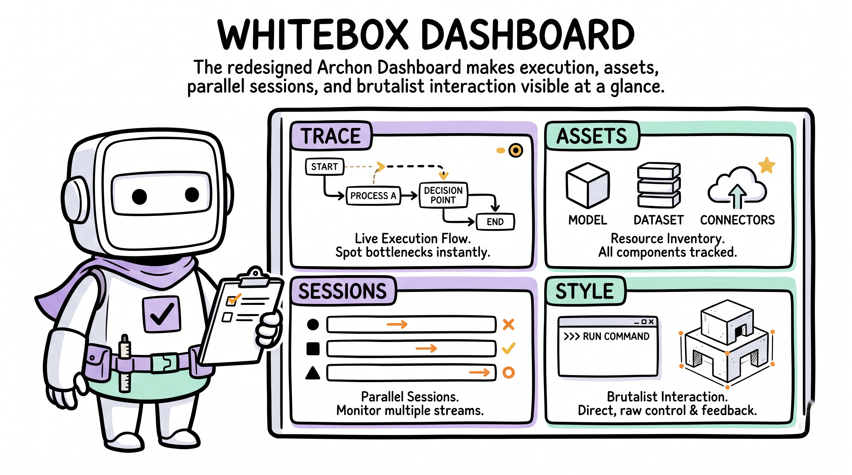
This PRD defines the next iteration of the Archon Dashboard's visual and interaction model: whiteboxed execution, entity-ized governance assets, concurrent-session management, and strict Light Voxel Brutalist adherence. For the portable Dashboard contract that governs any adopter project, see .archon/dashboard/.
1. Product Overview
1.1 Background and goals
The current Archon Dashboard achieves zero dependencies and SSE live refresh, but its visual presentation and information delivery are too flat — it doesn't convey Archon's hardcore autonomous-ownership character.
Core goals of this redesign:
- Whitebox execution — visualize the agent's thinking, decisions, and tool calls in real time; eliminate black-box anxiety.
- Asset entity-ization — turn abstract project state (progress, debt, knowledge, memos) into concrete "filing cabinets" that stakeholders can browse.
- Concurrent session management — support running multiple Archon processes simultaneously (e.g. two parallel demands) and switch/monitor them seamlessly in the Dashboard.
- Strict design-system adherence — fully apply Light Voxel Brutalist per the
design-systemskill.
1.2 Target user
The project's stakeholder (human developer / product manager) who needs to supervise Archon's work state, review architectural decisions, and check project health.
2. Design Language and Visual Metaphors
Strictly follows the design-system skill:
- Digital Rawness — solid fills, no frosted glass, no gradients.
- Structural Honesty — every module, card, and button carries
border-2 border-black(or thicker) solid black borders. - Pastel Contrast — canvas background (
#f6f5f4); highlights and categories use low-saturation pastels (Lavender, Pink, Yellow, Mint, Sky). - Mechanical Interaction — on click, the hard shadow is removed (
shadow-none) and the element physically shifts (translate-x-[4px] translate-y-[4px]). No smooth transitions; hard cuts only. - Typography — titles and key numerics use pixel font
VT323; body text usesInter.
3. Core Feature Modules
3.1 Multi-Session Switcher
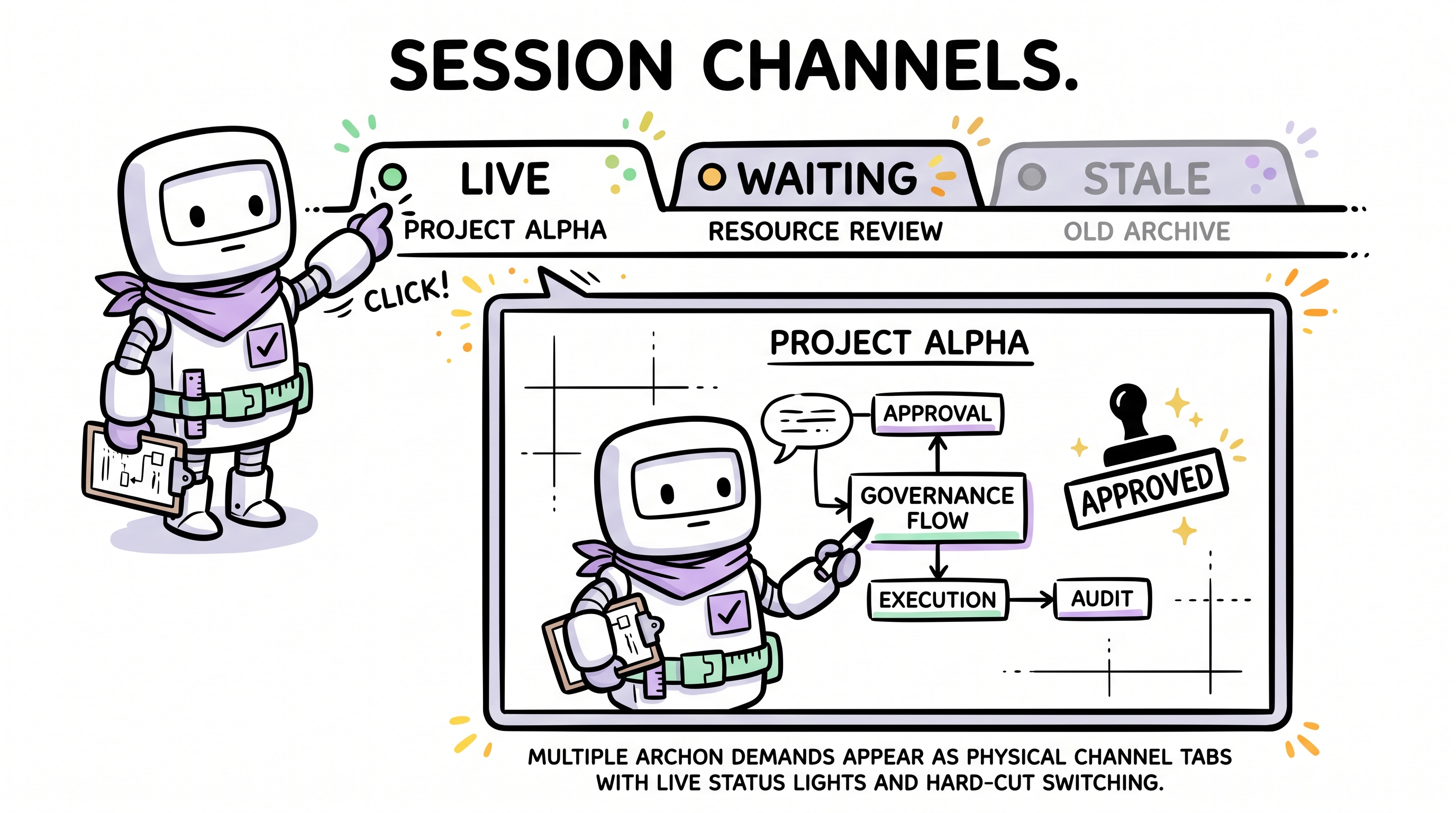
Scenario: the user runs /archon-demand request-1 in terminal A while running /archon-demand request-2 in terminal B.
- Visual metaphor: physical walkie-talkie channels / arcade coin slots.
- Location: top or left global navigation bar (The Command Bar).
- Mechanism:
- Dynamic generation — when a new heartbeat registration is detected, the nav bar "pops in" a new channel tab (with a physical pop-in animation).
- Status indicator light — every channel tab carries a pixel status lamp:
- 🟢 Blinking green:
Running(executing/thinking). - 🟡 Solid yellow:
Idle/Waiting(awaiting user confirmation, e.g. prompt-mode git commit). - ⚪ Dim grey:
Stale/Dead(heartbeat lost).
- 🟢 Blinking green:
- Information display — channel tab shows Session ID (e.g.
#A7F2) and a truncated demand summary (e.g.Demand: optimize login...). - Interaction — clicking a channel tab hard-cuts the main content area to that session's execution-trace view.
3.2 Live Execution Trace
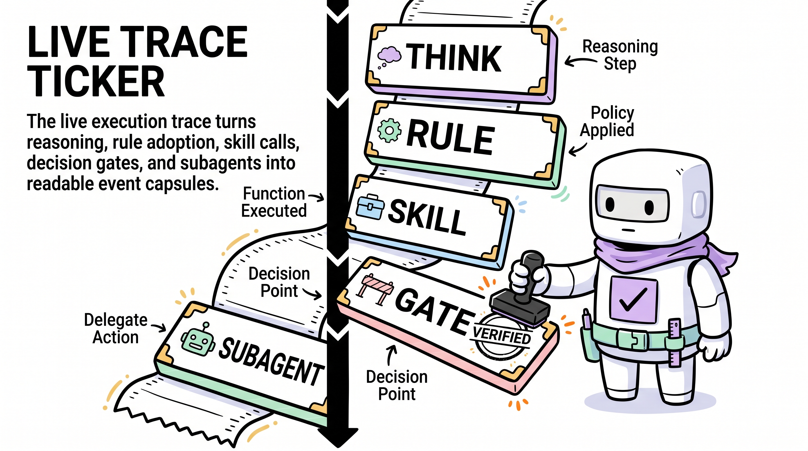
Scenario: the user clicks an active session to see what the agent is doing and thinking.
- Visual metaphor: old-school cash-register receipts / scrolling terminal logs (The Ticker).
- Layout: a vertical timeline running the full page (thick black line on the left); content blocks append downward; auto-scrolls to the newest record.
- Granular event capsules:
- 🧠 Reasoning — light-grey background card, monospace font, blinking
>prefix. - 📏 Rule Adoption — Lavender (
#e0d4ff) capsule, thick black border; shows rule source (e.g.[frontend.mdc]) and trigger reason. - 🛠️ Skill Invocation — Mint (
#b3ffe0) capsule, deep hard shadow; shows skill name (e.g.[design-system]) and action. - 🚪 Decision Gate — Yellow (
#fff3b3) highlight block. On Veto the border turns red and a red[ VETO ]pixel stamp appears in the top-right. - 🤖 Subagent Spawn — indented right, expands an inverted panel (pure black
#111111background, green monospace text) representing an independent process; shows subagent type (e.g.archon-capture-auditor) and its independent output stream.
- 🧠 Reasoning — light-grey background card, monospace font, blinking
3.3 Governance Assets Filing Cabinet
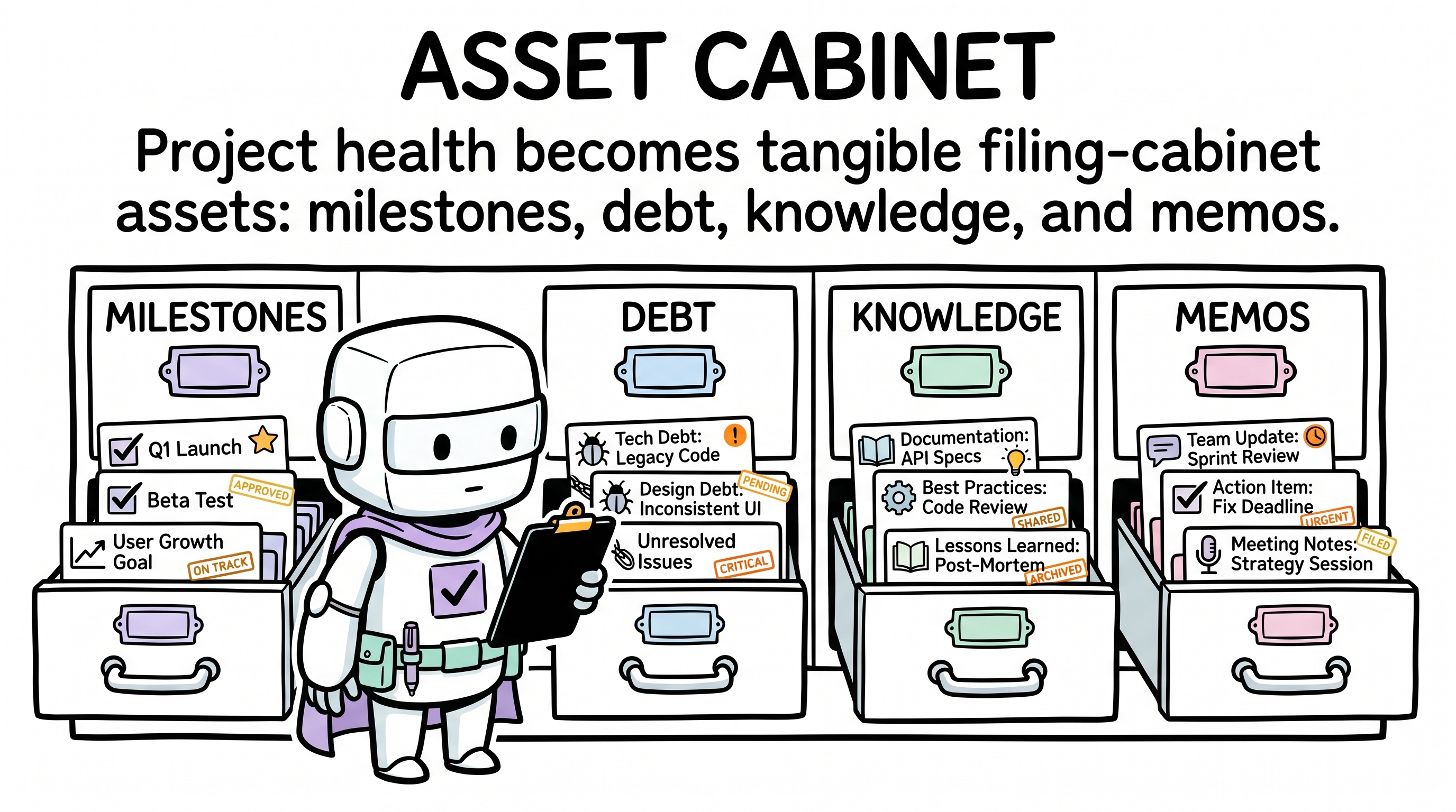
Scenario: the user wants a macro view of project health, progress, and historical decisions.
- Entry: fixed module in the global nav bar (separate from dynamic session tabs).
- Sub-module design:
- 🗺️ Milestones — Construction Board
- Style: oversized rectangular blocks.
- States: in-progress (yellow-black diagonal-stripe border,
border-4); done (Mint background + black tilted[ CLEARED ]stamp); not started (dashed hollow border). - Content: physical checkboxes
[X]showing feature acceptance and quality-gate status.
- 🔴 Debt Tracker — Wanted-Poster Wall
- Style: densely packed grid cards.
- Hierarchy: thick colored side-band on the left indicates severity (Critical red strobe, Warning yellow, Info blue).
- Typography: oversized pixel font shows the ID (e.g.
DEBT-016); overdue dates in red. Resolved cards are greyed and stamped green[ PAID ].
- 🧠 Knowledge Base — Tool Wall
- Rules: tall vertical cards topped with a black "clip" graphic (metaphor: mandatory constraint).
- Skills: wide horizontal cards with very deep hard shadows (metaphor: heavy tool).
- ADRs: retro punch-card style. Rejected ADRs carry a thick diagonal strike-through and a red
[ VETOED ]stamp.
- 💬 Memos — Polaroid Sticky Notes
- Style: Yellow (
#fff3b3) square cards with a black pixel "pin" graphic at the top. - Typography: monospace date in top-left, centered bold conclusion, mimicking physically hand-written notes.
- Style: Yellow (
- 🗺️ Milestones — Construction Board
4. Page and Information Architecture
Two stable regions:
| Region | Content | Behavior |
|---|---|---|
| Global top nav (The Command Bar) | Fixed asset entries: Overview, Milestones, Debt, Knowledge, Memos. Dynamic session tabs: Session ID + demand summary + status light | SSE drives add/remove of session tabs; click hard-cuts the main content area |
| Main viewport | Fixed asset view or the live execution trace of the selected session | No soft route animations; view switches must preserve the mechanical-gear feel |
5. Interaction and Animation Spec
- Hard cuts — forbid
opacityfades orease-in-outpage transitions. View switches must be instantaneous and may include a very short (50ms) 1px X/Y shake to mimic mechanical-gear engagement. - Brutal press — every clickable element (tabs, cards, buttons) changes only brightness (
brightness-95) onhover; onactive(press), shadow disappears (shadow-none) and the element shifts (translate-x-[4px] translate-y-[4px]). - Live injection flash — when SSE pushes new data (e.g. a new Debt entry, or one more reasoning step in the trace), the new DOM element's background flashes Yellow (
#fff3b3) and hard-cuts back to its original color within 300ms — the "data physically slammed into the panel" effect. - Auto-scroll lock — in the session execution-trace view, the scroll is by default pinned to the bottom. If the user scrolls up, the lock releases and a floating
[ ↓ RESUME TRACKING ]brutalist button appears.
6. Data Sources and Technical Constraints
- Frontend constraint: zero dependencies; pure Vanilla JS + HTML + CSS. CSS must strictly align with the project's design-system tokens (hand-written classes or reused compiled styles).
- Data-driven:
- Asset data comes from the existing
schema.jsparser (readsmanifest.md,debt.md,drift.md,.archon/decisions.md). - Multi-session execution-trace data comes from
.cursor/archon/dashboard/heartbeats/*.json.
- Asset data comes from the existing
- SSE contract: the backend
server.jsmust trigger an SSEupdateevent whenever a heartbeat file is updated; on receipt, the frontend re-fetches/api/stateand performs incremental/full view repaints (wired to the live-injection-flash animation).